Showing posts with label logo. Show all posts

Car Logo: Pontiac Solstice
2011 Pontiac Solstice

Car Brand: Pontiac Solstice

In December, 2010, a award «The Most Sexual Inexpensive Roadster» from Playboy experts unanimously left to Pontiac Solstice.

As a whole car designers tried to make this car such that the coupe had a maximum of similarity from a roadster. As speech goes about rather budgetary car. Buyers still choose from two versions of Solstice (coupe or roadster).

The coupe is equipped by the 173-strong motor in volume of 2,4 liters + 5-step gear box (mechanical). More powerful Pontiac Solstice GXP version is equipped by the 260-strong Ecotec 2.0L DI Turbo VVT + 5-step transmission (auto).

The Most Elegant Car Logo

Roadster Pontiac Solstice
Solstice
Pontiac
Coupe Pontiac Solstice
2011 Pontiac Solstice

Logo: Pontiac

Pontiac logo

2014-07-03
Design Trends of Logos
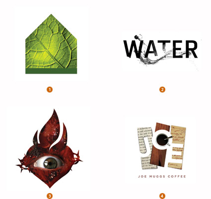
PhotoFill

PhotoFill

1. El Paso, Galeria de Comunicacion, Lazar Greenhouses
2. TOKY Branding+Design, The Pulitzer Foundation for the Arts
3. APSITS, DIESEL
4. Big Communications, Joe Muggs Coffee

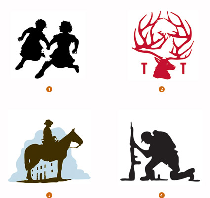
Concealed

Concealed

1. Calacampania Studios, Calagraphic Design
2. Duffy & Partners, Gander Mountain
3. The Bradfor Lawton Design Group, REOC
4. Felixsockwell.com, New York Times

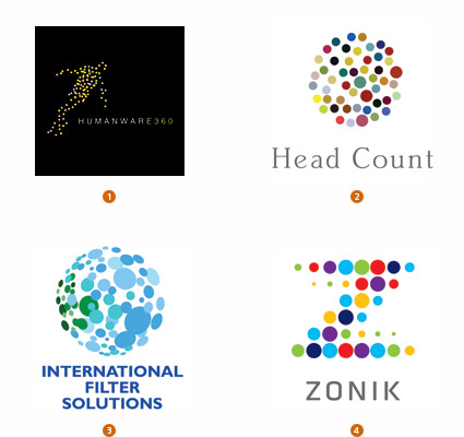
VariDot

VariDot

1. Alin Golfitescu
2. Thread Design, Head Count Asia
3. Blue Sky Design, International Filter Solutions
4. Lippincott, Zonik

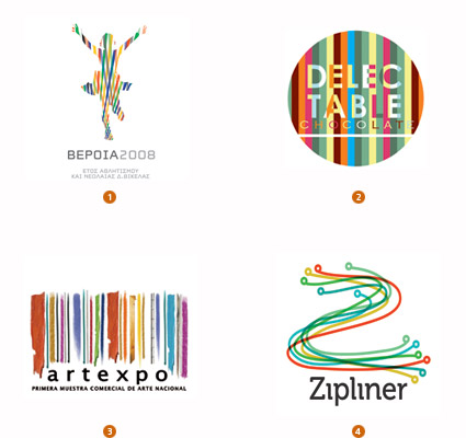
Candy Stripe

Candy Stripe

1. ORFIK DESIGN, DVA SA
2. Liquid Pixel Studio, Delectable Chocolate
3. juancazu, camara de comercio de bogota
4. dache, Zipline

Texting

Texting

1. Chris Rooney Illustration/Design, Heavenly Ski Resort
2. Bryan Cooper Design, Tulsa Glassblowing Studio
3. Sussner Design Company, saint barts
4. GDNSS, cheapairlines.com

Encrust

Encrust

1. Mattson Creative, Career Artist Management
2. cogu design, Yvonne Coutinho
3. Graphics & Designing Inc., MTK
4. Jobi, Sam and Shahir Ahmed

Monologue

Monologue

1. Airside, Airplot
2. Wolff Olins, Macmillan Cancer Support
3. Base, Greene Hill Food Co-op
4. Base, Greene Hill Food Co-op, Lockup Variation

Doily

Doily

1. Iperdesign, Inc., splurge dessert
2. R&R Partners, Harrah’s
3. Diagram, Eligiuz
4. Gesture Studio, Isaias Gil

Flip Flop

Flip Flop

1. MINE, Scheyer/SF
2. Pearson Education Ltd, Pearson Education
3. NOT A CANNED HAM, Graco
4. Roy Smith Design, Shaun Saxon Photography

Mosaic

Mosaic

1. Team Y&R, Khalid Bin Haider Group
2. Kommunikation & Design, Gartenwelt Manz
3. dache, webmynd
4. NATIONAL Public Relations, Greater Montreal

Sequential

Sequential

1. Gardner Design, BiTemp
2. RedBrand, LexPro
3. metaforma design, RACE research for an alternative and clean energy
4. Schwartzrock Graphic Arts, Design Center

Recycle

Recycle

1. rylander design, Refabric, Inc.
2. Tyme Inc., Office Depot
3. BrandBerry, non-commercial
4. Kevin France Design, Inc., VF corp

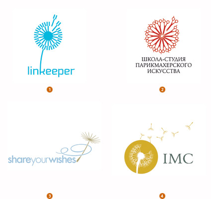
Dandelion

Dandelion

1. Ulyanov Denis, linkeeper
2. RedBrand, Barberschool
3. LaMonica Design, Morningstar Communications
4. Courtney & Company, IMC Group

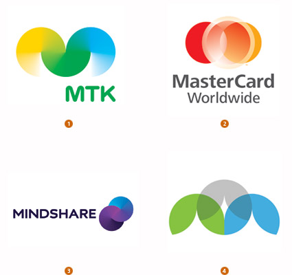
Circulate

Circulate

1. Porkka & Kuutsa Oy, Central Union of Agricultural Producers & Forest Owners
2. FutureBrand, MasterCard Worldwide
3. Moving Brands, Mindshare
4. Gardner Design, PBA Architects

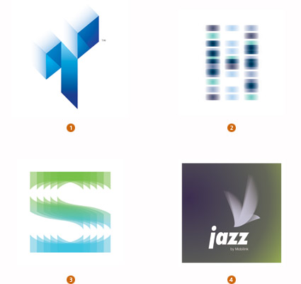
Gossamer

Gossamer

1. Michael Freimuth Creative, Tone Animation, LLC.
2. Roy Smith Design, Hooke Laboratories
3. Roman Kotikov, Soft cafe
4. Alin Golfitescu, mobilink pakistan
2014-07-01
The Best Car Slogans
Toyota
2009-11-27
Canon

Logo Canon

In 1930 in Japan Goro Yoshida and stepbrother Saburo Uchida have created the company from nothing name Precision Optical Instruments Laboratory speaking to us in Japan. Four years after workings out have led to creation of their first camera which they named Kwanon, in honour of a Buddhist deity of mercy. All one thousand hands was not located on a logo, but how many could — so much and have found room. Have added tongues of flame and have received more soon a picture from ancient books, rather than a logo.

The company has registered weight of words which were similar on sounding with Кwanon for protection of the trade mark. One of them — already known to us Canon — as a result has replaced the original name. To an existing logo of technics Canon already more than 50 years, and the logo looks to this day is modern.
2009-08-07
International Business Machines

Logo IBM

Company IBM history has begun owing to the confused and long-term association of the most different companies — ITR, CSC, CTR.

In 1924 of shift at last have come to the end, and again opened company was called — International Business Machines.
In the late forties IBM at last it was switched to the basic now an activity kind — on computers (before they were engaged even in devices for meat cutting). And to commemoration so sweeping changes IBM has presented a new logo — extremely simple and clear. Unlike that enchanting spectacle which at them was before.

Last serious change with a logo has happened in 1972 — "for transfer of speed and dynamism" monolithic letters have ruled and have painted in blue colour.
Kodak

Logo Kodak

First cameras Kodak have appeared in 1888. The campaign slogan sounded so: "You press the button, we do the rest".

In far 1900 Kodak were one of the first who has tried to integrate a name and an image of the company into a symbol.
In 30th years in a logo have appeared habitual yellow and red colour.
In 60th years in a logo there were corners and rotundities from which, later 10 years — have refused.
Throughout 1971-2006 the logo essentially did not vary. And in 2006 logo have simplified, having given to a logo more modern kind.
MasterCard

Logo MasterCard

In 1966 17 bankers have united in Interbank Card Association (ICA) which symbol became Latin "i".
In 1969 bank have renamed in Master Charge, and in a logo there were two crossed circles. Symbolical "i" have placed in the bottom right corner.
In 1979 Master Charge have renamed in MasterCard, and the letter "i" has disappeared from a logo absolutely.
In 1990 there were horizontal strips, as a symbol of interbank mutual relations.
Hello, Moto!

Logo Motorola

Company Motorola — who could think! — there are 80 years.

From the beginning of 30th years she was engaged in release of phones for cars, and 50 years later was switched to commercial manufacture of mobile phones.

The name of the company which not that other as the word "motor" united with a suffix popular at that time "-ola", was written by a curly cursive is primary, and the letter "M" has appeared in 1955.
Informing the company management has declared change of the trade mark, that "two triangular peaks directed up form an arch in the form of abstract M, symbolising progressive tendencies of company Motorola".
Mozilla Firefox

Logo Mozilla

In 2002 the companies not engaged in the goods or services for children still could have here such logos, as this fantastic birdie (though they and now appear). Dave Hyatt and Blake Ross have created free web browser Phoenix. Which they have there and then renamed in Firebird and have there and then renamed in Mozilla Firefox.

In 2003 of children with letters John Hicks from Hicksdesign, the interface designer suffering from terrible creative enthusiasm hardly probable has not filled up. Through any time Mozilla has invited him to make the new sketch and has received the well-known logo which, speak, even from space it is visible.
Nike

Logo Nike

Flourish Nike, being hardly probable not most recognised sign in the world, has thought up the student of Portlend University Caroline Davidson in 1971. To the student have paid for a logo of 35 dollars, even at the account of the prices of those years it is insignificant money.
The design of a logo almost has not undergone changes for 37 years — has exchanged only inscription Nike, and now and has at all disappeared.
Nokia

Logo Nokia

In 1865 Knut Fredrik Idestam has organised in the southwest of Finland cellulose factory. Agree, very strange beginning for the company known now for mobile phones.
The company began to carry name Nokia after has moved on river Nokianvirta coast to city Nokia. By the way, the word "Nokia" in the Finnish language designates dark, very fur animal, something like an ermine.
It is interesting, that the trade mark luxury mobile phones Vertu — the second part of the name of the river Nokianvertu.
Shell

Logo Shell

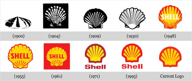
Company Shell has appeared in 1891 and was engaged in sea transportation of kerosene.

The first logo of the company represented an exact black-and-white reproduction of a bowl of a comb. In the course of time the logo gradually varied according to new trends in graphic design. The modern logo has been created by known designer Raymond Loewy in 1971. Today the logo is so recognised, that is often used without instructions of a name of the company.
Sony

Logo Sony

In history of logo Sony the interesting moment was only one — the very first a logo which now looks very lovely and ridiculously.

In 1960 the first step to that logo which the company now has has been made. The modern version has been developed in 1973, and the company management is not going to change anything in spite of the fact that to them offers on restyling or cardinal change regularly arrive. And they can be understood — laconic, very simple word Sony in this kind knows all world and has no, to word Sony — any claims.
Starbucks

Logo Starbucks

Evolution of logo Starbucks, perhaps, most amusing of all presented here.

Look at the very first siren-mermaid in a circle. The Rubens beauty without a navel, with two tails and a magnificent breast — excellent, very ridiculous image. The company explanation is even more ridiculous: "It was supposed, that this siren as is seductive, as well as coffee Starbucks".

Starbucks logo

When in 1987 Starbucks has united with company Il Giornale, the logo became more chaste and more accurate.

Mammary glands have covered with magnificent hair, have attached a navel on the necessary place and have made general "zoom" on a siren not so to draw attention of an audience to thoughts on that, what for to a siren two tails and whether are that interesting between them.

Starbucks

In 1992 the logo became such what is at present. The consumer already have closely moved up to the mermaid, and a distressful navel it not became visible.
No More Unique Logos

Carrier

2009-07-02
BMW

Car logo BMW

2009-06-29
Audi

Car logo: Audi

FIAT
Car logo: FIAT
Ford

Car logo Ford

Peugeot

Car logo: Peugeot