Showing posts with label redesign. Show all posts
2009-11-27
The company has registered weight of words which were similar on sounding with Кwanon for protection of the trade mark. One of them — already known to us Canon — as a result has replaced the original name. To an existing logo of technics Canon already more than 50 years, and the logo looks to this day is modern.
First cameras Kodak have appeared in 1888. The campaign slogan sounded so: "You press the button, we do the rest".
In far 1900 Kodak were one of the first who has tried to integrate a name and an image of the company into a symbol.In 30th years in a logo have appeared habitual yellow and red colour.
In 60th years in a logo there were corners and rotundities from which, later 10 years — have refused.
Throughout 1971-2006 the logo essentially did not vary. And in 2006 logo have simplified, having given to a logo more modern kind.
After merge the company has received name Lucky Goldstar, and in 1995 has replaced a signboard on LG Electronics.
Today LG — the huge South Korean conglomerate including such companies as LG Chemicals, LG Telecom, and even baseball command LG Twins.
All companies are guided by the motto: «Life is Good».
In 1969 bank have renamed in Master Charge, and in a logo there were two crossed circles. Symbolical "i" have placed in the bottom right corner.
In 1979 Master Charge have renamed in MasterCard, and the letter "i" has disappeared from a logo absolutely.
In 1990 there were horizontal strips, as a symbol of interbank mutual relations.
Company Motorola — who could think! — there are 80 years.
From the beginning of 30th years she was engaged in release of phones for cars, and 50 years later was switched to commercial manufacture of mobile phones.The name of the company which not that other as the word "motor" united with a suffix popular at that time "-ola", was written by a curly cursive is primary, and the letter "M" has appeared in 1955.
Informing the company management has declared change of the trade mark, that "two triangular peaks directed up form an arch in the form of abstract M, symbolising progressive tendencies of company Motorola".
In 2003 of children with letters John Hicks from Hicksdesign, the interface designer suffering from terrible creative enthusiasm hardly probable has not filled up. Through any time Mozilla has invited him to make the new sketch and has received the well-known logo which, speak, even from space it is visible.
The design of a logo almost has not undergone changes for 37 years — has exchanged only inscription Nike, and now and has at all disappeared.
The company began to carry name Nokia after has moved on river Nokianvirta coast to city Nokia. By the way, the word "Nokia" in the Finnish language designates dark, very fur animal, something like an ermine.
It is interesting, that the trade mark luxury mobile phones Vertu — the second part of the name of the river Nokianvertu.
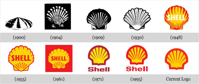
Company Shell has appeared in 1891 and was engaged in sea transportation of kerosene.
The first logo of the company represented an exact black-and-white reproduction of a bowl of a comb. In the course of time the logo gradually varied according to new trends in graphic design. The modern logo has been created by known designer Raymond Loewy in 1971. Today the logo is so recognised, that is often used without instructions of a name of the company.In history of logo Sony the interesting moment was only one — the very first a logo which now looks very lovely and ridiculously.
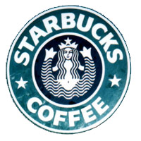
In 1960 the first step to that logo which the company now has has been made. The modern version has been developed in 1973, and the company management is not going to change anything in spite of the fact that to them offers on restyling or cardinal change regularly arrive. And they can be understood — laconic, very simple word Sony in this kind knows all world and has no, to word Sony — any claims.Evolution of logo Starbucks, perhaps, most amusing of all presented here.
Look at the very first siren-mermaid in a circle. The Rubens beauty without a navel, with two tails and a magnificent breast — excellent, very ridiculous image. The company explanation is even more ridiculous: "It was supposed, that this siren as is seductive, as well as coffee Starbucks".When in 1987 Starbucks has united with company Il Giornale, the logo became more chaste and more accurate.
Mammary glands have covered with magnificent hair, have attached a navel on the necessary place and have made general "zoom" on a siren not so to draw attention of an audience to thoughts on that, what for to a siren two tails and whether are that interesting between them.At Internet auction eBay rather original car Hummer H1 is exposed.
According to the present owner, this car "is involved more attention, than with any other autoexotic".The unknown master of tuning has transformed an off-road car into the real monster on wheels.
The starting price of the car — $89 thousand though the owner has spent $185 thousand for tuning.
Popular Posts:
- Mercedes Crystal Benz
- BDSM Lego
- Design Trends of Logos
- Tuning of the Cadillac Escalade from Forgiato
- New Interior, New Motor, New Corolla
- Volkswagen Beetle Cabriolet
- McLaren F1 for Millionaires [limited edition]
- Avalon + RAV4 + Furia = New Toyota Corolla
- Three Versions For the Updated X5
- Alfa Romeo 4C: the [creation process]


